Aniflow, specializing in real estate investments, desired a contemporary brand identity to resonate with its youthful target audience. The objective was to create a brand that reflected Aniflow’s reliability, innovation, and commitment to quality while captivating the 25-35 age group.
Monobook Studio undertook the task of developing a comprehensive brand transformation for Aniflow. This encompassed extensive market research, ideation sessions, and the creation of a brand strategy. The focal point was redesigning the logo to reflect the flow concept while maintaining the company’s established brand essence.
One of the significant challenges was evolving the existing brand identity to appeal to a younger demographic while preserving the essence of Aniflow’s reputation in the real estate investment sector. Creating a logo that embodies the flow concept while being visually appealing and versatile across various mediums posed another challenge.
Monobook Studio utilized industry-standard tools like Adobe Illustrator, leveraging sketching, digital design techniques, and iterative processes to conceptualize the logo based on the flow concept. Collaborative sessions and feedback loops were instrumental in refining the design.

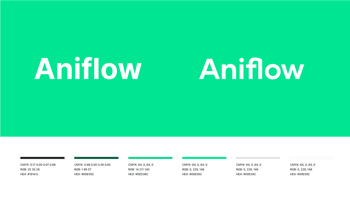
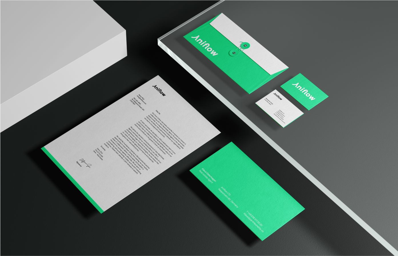
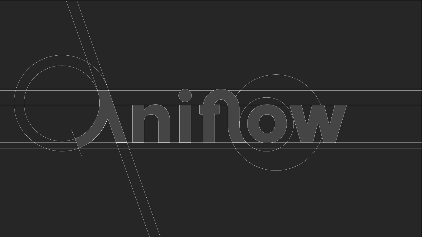
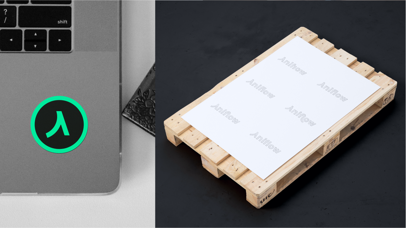
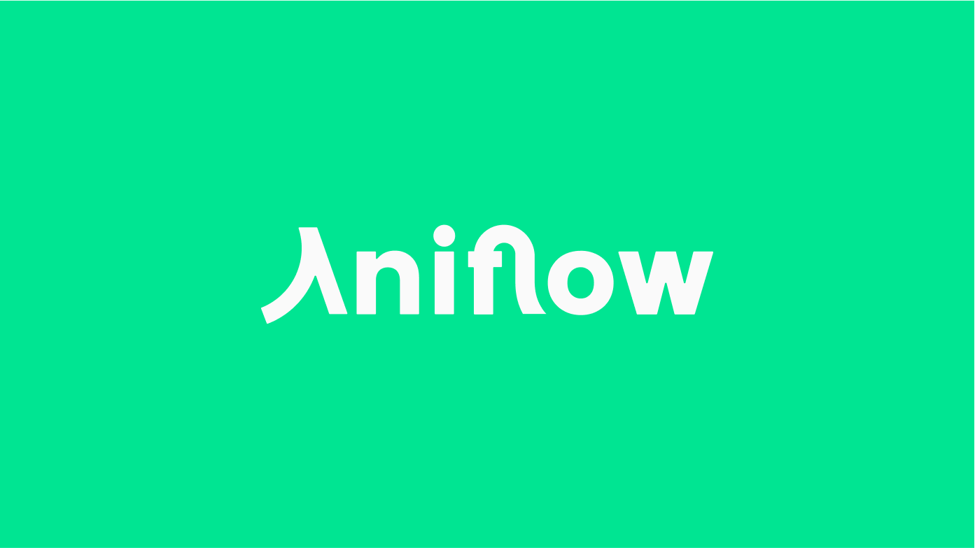
The final logo design captured the essence of Aniflow’s flow concept elegantly, with interconnecting letters ‘F’ and ‘L’, signifying the seamless flow within the real estate investment sector. The vibrant and contemporary logo was well-received, aligning perfectly.
The project commenced with thorough market analysis and brainstorming sessions to understand Aniflow’s ethos and the preferences of the target audience. Iterative sketching and digital design explorations were presented, and collaborative feedback led to the finalization of the logo, ensuring it resonated with the youthful demographic while embodying the flow and connection concept.
Monobook Studio collaborated closely with Aniflow’s marketing and leadership teams, incorporating their insights throughout the design process. This collaboration greatly influenced the final design, ensuring alignment with Aniflow’s vision.
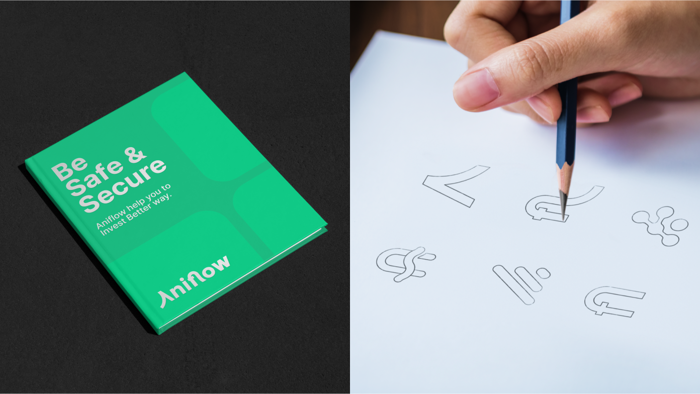
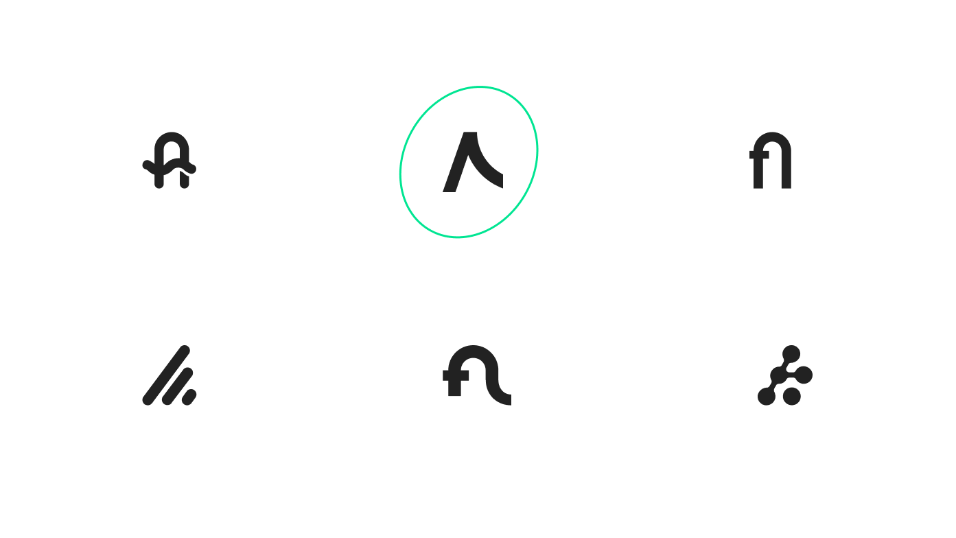
During the initial ideation phase, Monobook Studio generated 50 diverse sketches exploring the flow concept for Aniflow’s logo. Through a rigorous evaluation process based on brand relevance and target audience appeal, the pool was narrowed down to 6 top concepts. Collaborative discussions with Aniflow’s team led to the selection of one standout concept that best-embodied flow and connectivity while aligning with the brand’s identity.
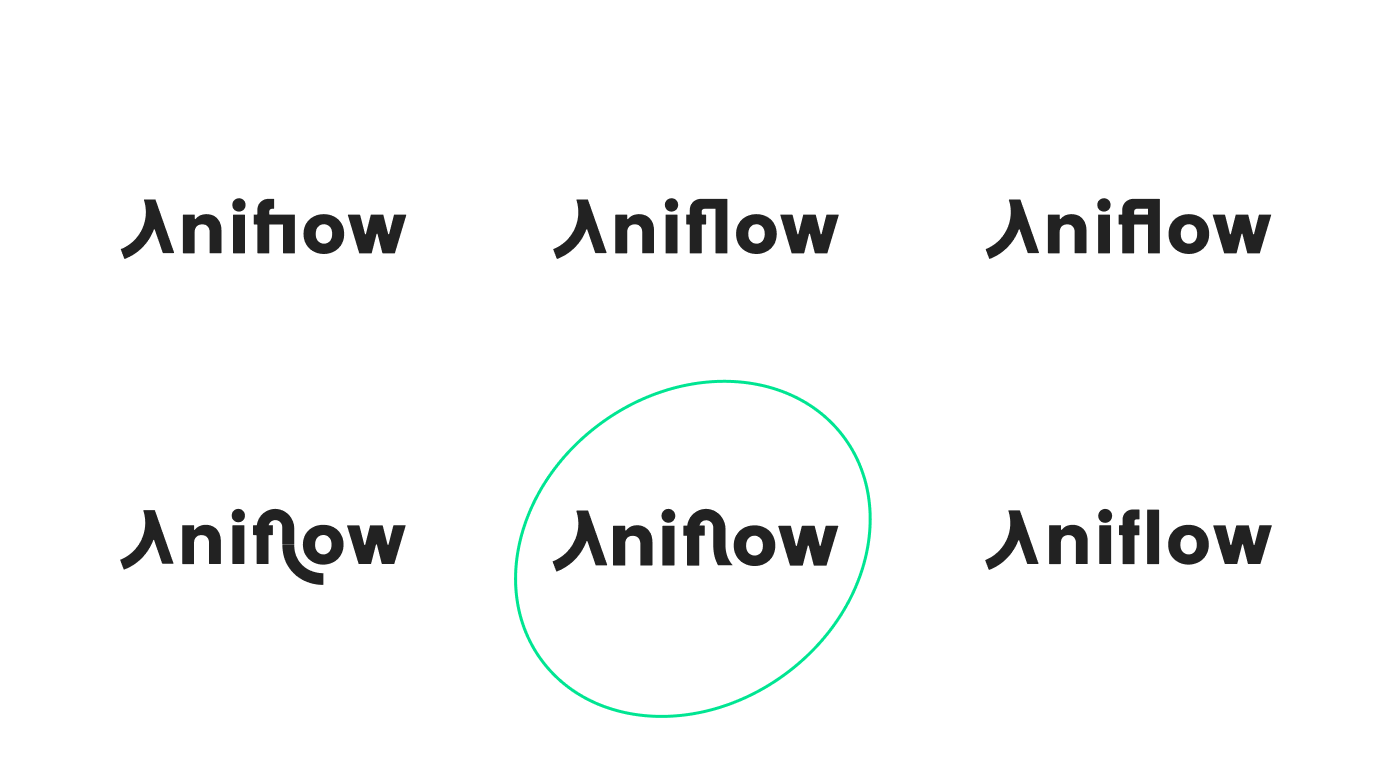
Subsequently, Monobook Studio developed six wordmark variations based on the chosen concept. Each variation maintained the same essence but explored different typographic styles and compositions. The iterations were crafted to ensure visual consistency and cohesion with Aniflow’s brand strategy and preferences. These variations were presented, refined, and iterated upon collaboratively until the most fitting representation emerged.
the final stage, through collaborative decision-making, the chosen wordmark was meticulously selected. This wordmark seamlessly encapsulated the flow concept, resonating with the youthful demographic while signifying Aniflow’s credibility and innovation in the real estate investment sector. The entire process highlighted Monobook Studio’s dedication to ensuring the perfect synthesis of concept, design, and brand essence for Aniflow.