Two ways to rebrand.
Know the mark? Fix what is broken. New to the market? Start from zero.
Case one: refined
Mayfair Lumber Sales Ltd, Alberta
A wholesale lumber company in Alberta, Canada, more than four decades old. We rebuilt their mark, colour and type.
- Who
- A wholesale lumber company in Alberta, Canada, more than four decades old.
- What we did
- We rebuilt their mark, colour and type.
- How it was run
- By email and video call, from Satkhira to Alberta.
The gap
Small things showed at every size.
The original mark was made by hand. After more than four decades, corners did not match, the space on both sides was uneven, and the lines of text sat on mixed alignments.
None of it was loud. All of it made the brand look less certain than the company is.
The brief
Fix only what is broken.
Changing a mark people already know is a risk. So the brief was narrow: fix only what is broken, and keep everything people recognise.
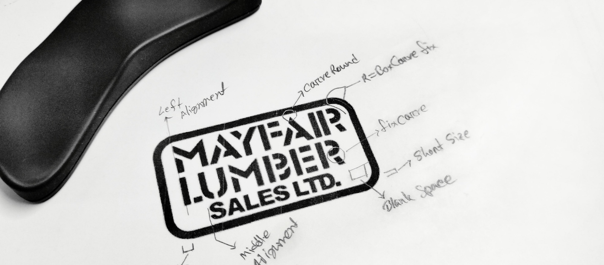
Before and after
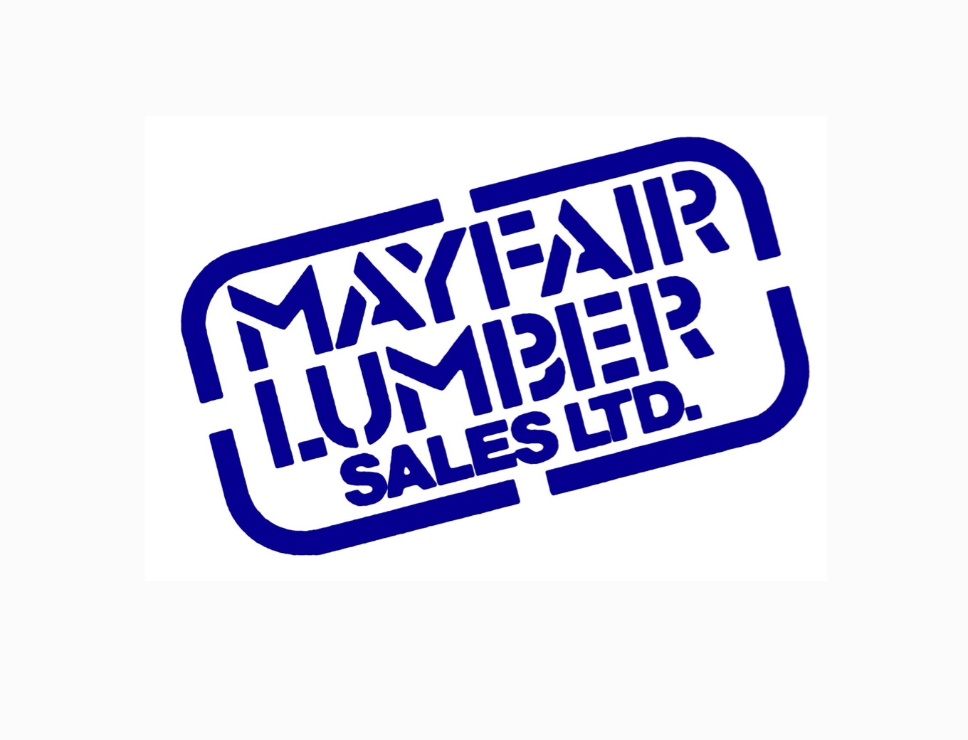
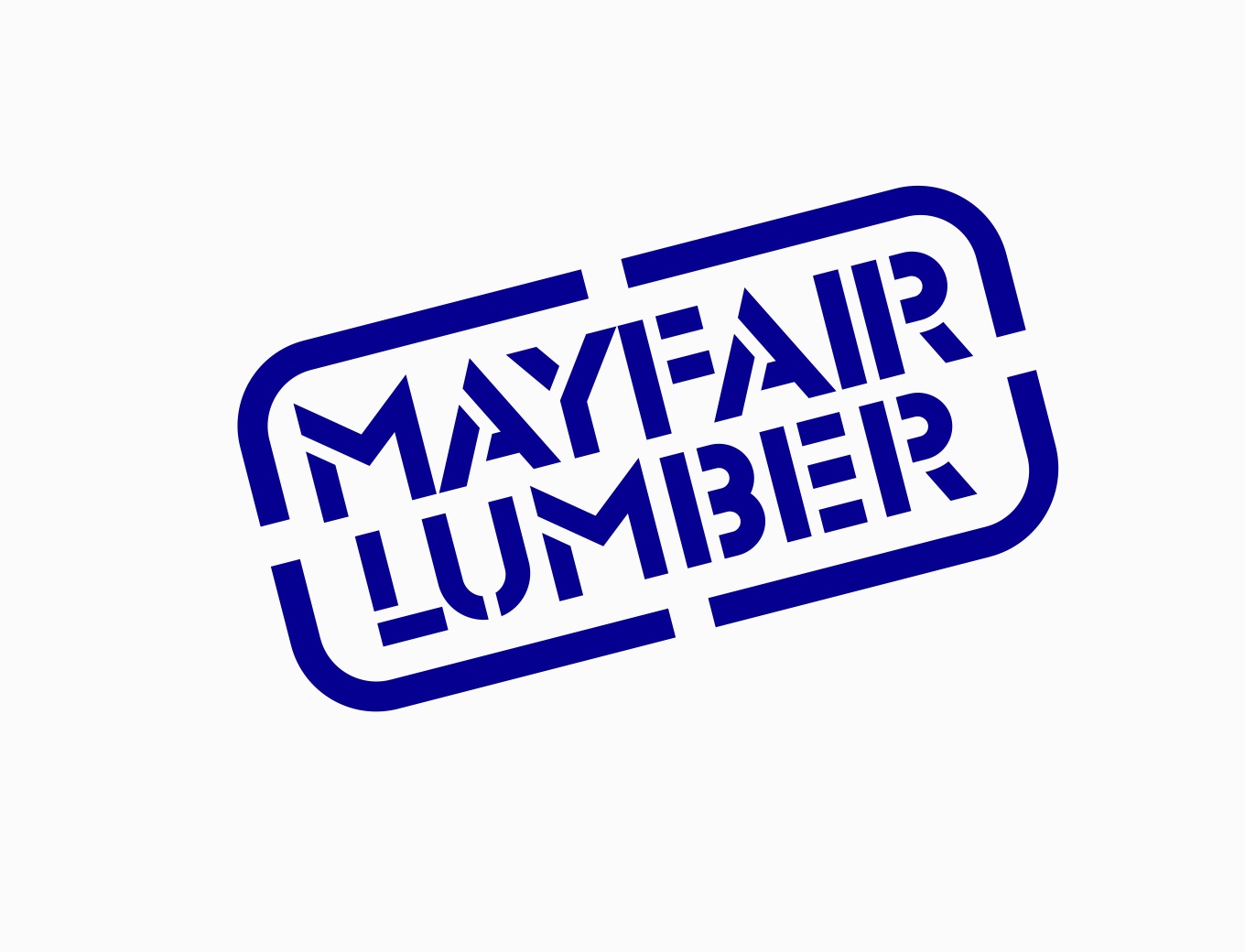
Fixed, not reinvented.
- Corners and curves now match each other across the whole mark.
- Every line of text is centred, with even space around it.
- Angles are now square, so the mark stays simple to read and to reproduce.
- A gap between two letters was corrected where they read as one shape.
Colour
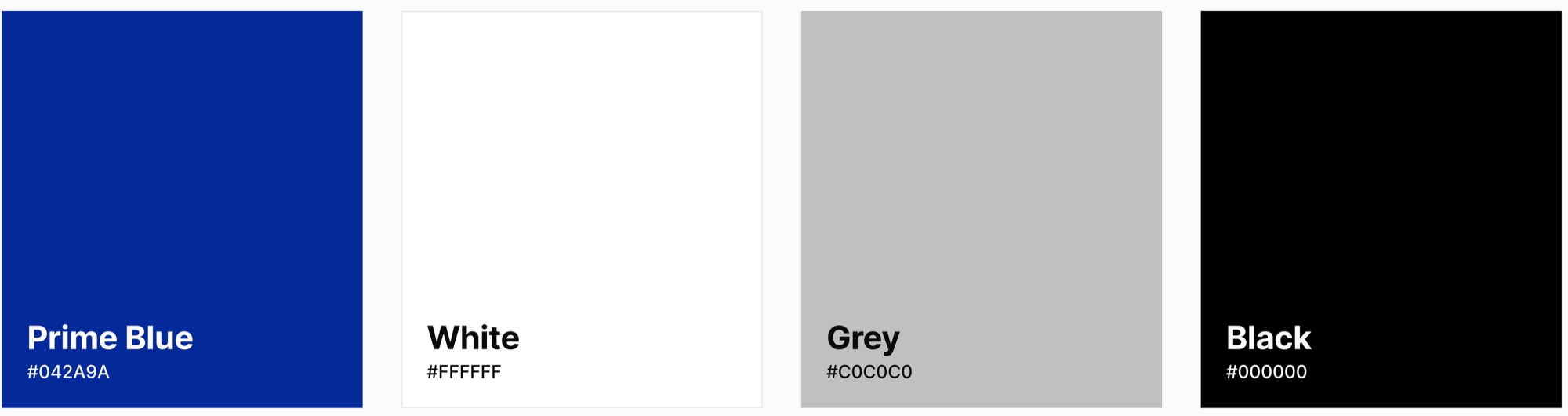
Four colours. Use them as written.
Typeface
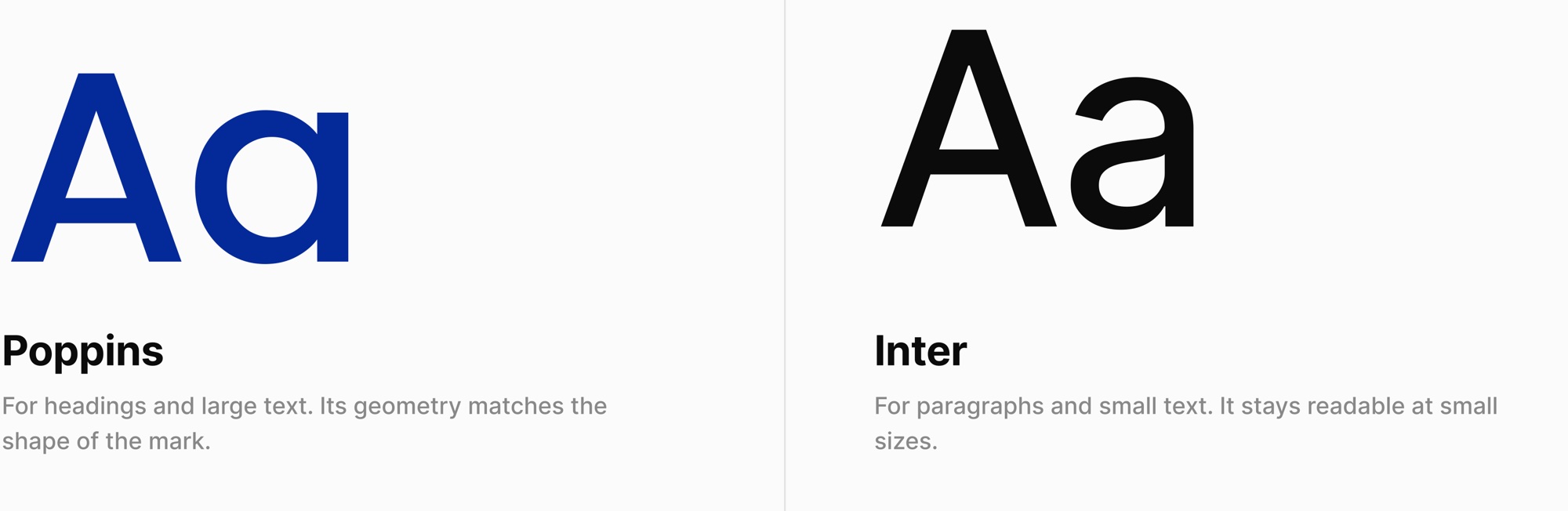
Two typefaces, each with one job.
In their words
“Monobook was hired to do a visual rebrand for our 40+ year organization. He was an excellent communicator, showed exceptional passion for the project, and delivered a finished product exactly what we were hoping for.
I will be using Mehedi for future projects related to visual brand identity and will be recommending to friends. Thank you for your detail-oriented work and pride you take from your work.”
Case two: built new
Gärtnerabo
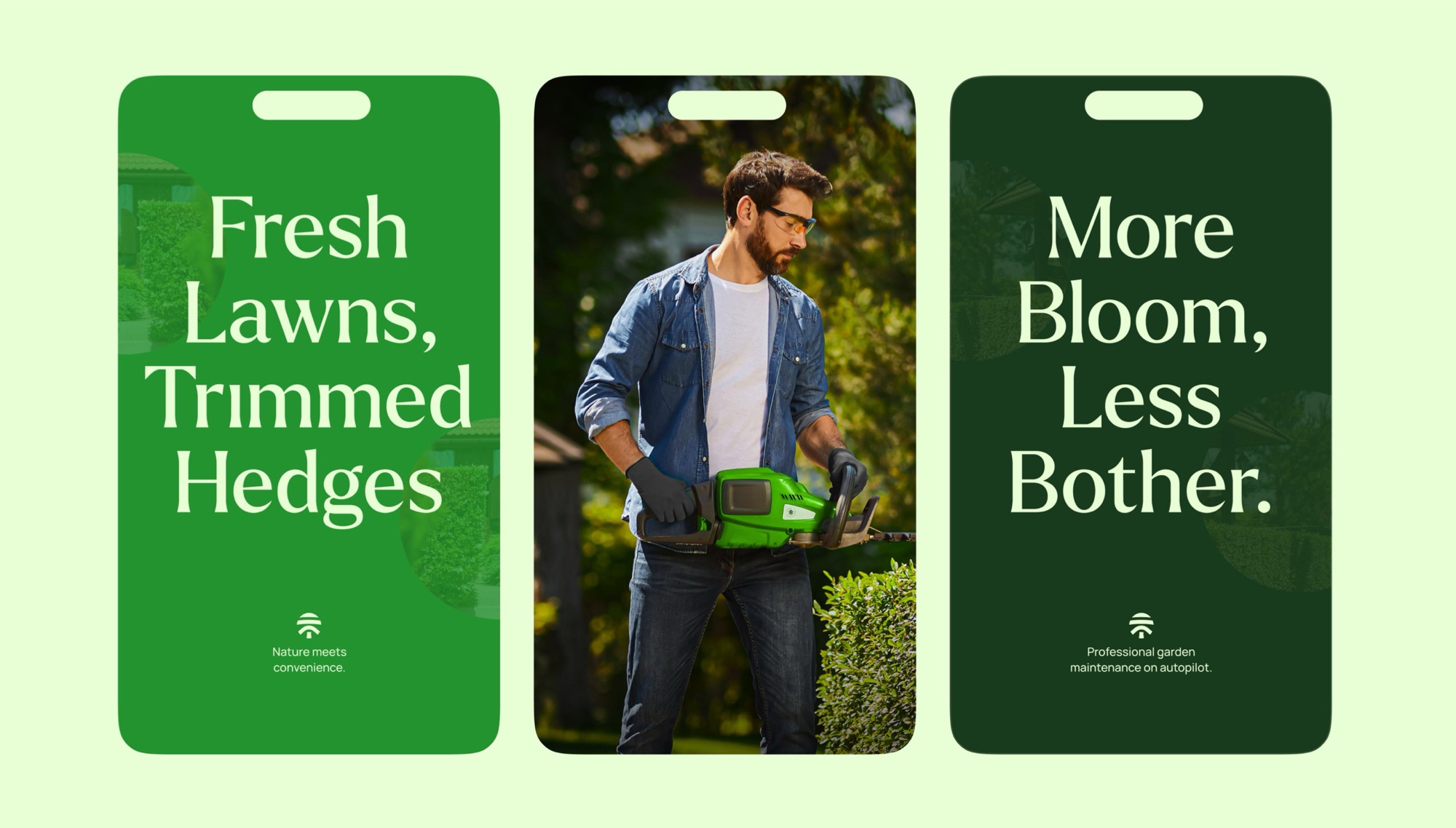
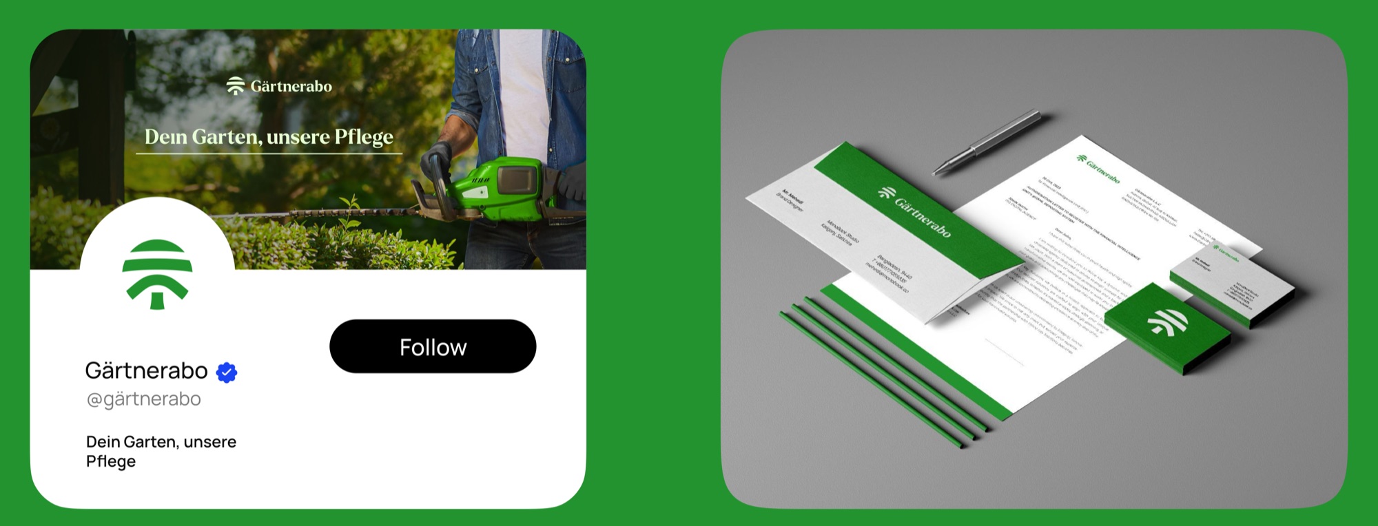
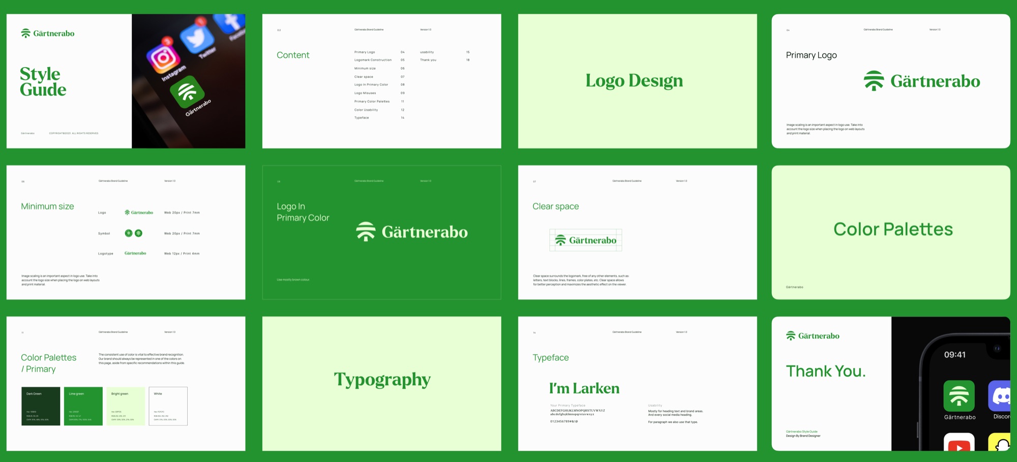
A garden care subscription service. We built their identity new: logo, logotype, colour system, guideline and applications.

- Who
- A garden care subscription service for people who want a well-kept garden without the hassle.
- The brief
- A brand that feels professional, caring and fresh.
- What we did
- Logo, logotype, colour system, brand guideline and applications.
- The mark
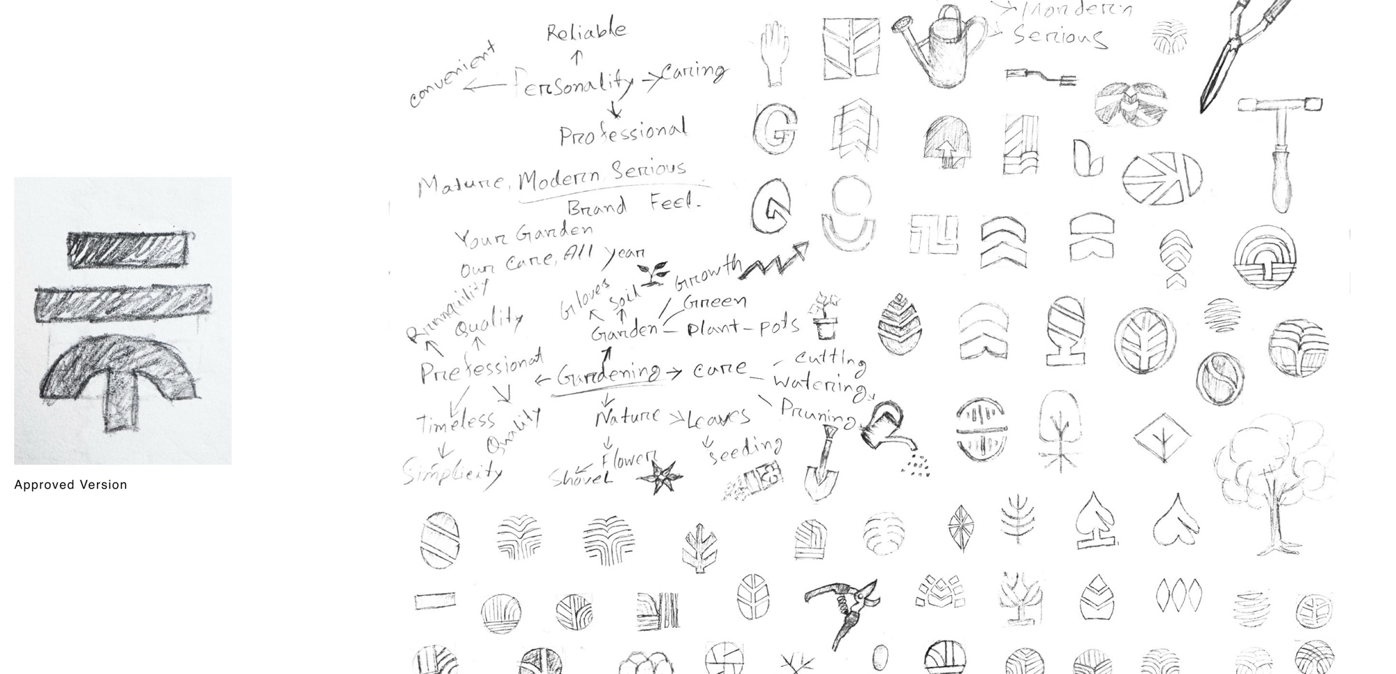
- A tree made from simple shapes. Straight lines for the land, a half circle for the changing seasons, a circle for the whole tree.
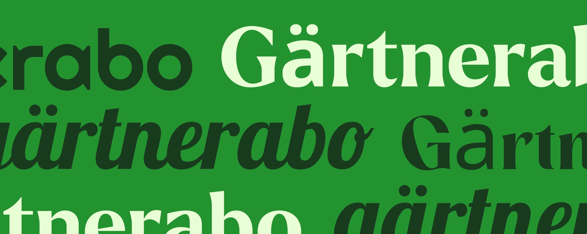
One brand, out in the world.